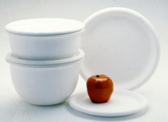
Anyway, the friendly shape became “Prego”, a classic.


Anyway, the friendly shape became “Prego”, a classic.

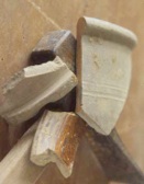
In the early 2000s, we got a commission with Waterford Wedgwood do do something with an “English garden” feel. This was right up our alley, as we were architectural historians, loved Gertrude Jekyll, and everything about English landscape gardening in general. We were restoring a 1750 German Palladian house in Pennsylvania at the time. We made some sketches of grapevine motifs from medieval stone carvings on cathedrals in France and England, and thought this would be the correct approach.


Another completely different dinnerware design we did, called “Two for the Table”, involved an oversized coup plate “the scoop coupe”, and a salad plate, which would become the primary plate in actual fact, and a centrifugally molded glass plate, which would become an all purpose plate for cold food. This was something different, and we had been kicking it around for a few years. Hope went to Thailand to develop this, and worked with factories in Bangkok, It was wood-fired with a resist, and it is our personal everyday dinnerware to this day.

It has a decidedly Asian feel, and we tried to make the teapot be referential to cast-iron Japanese teapots.
When we first designed this, Dansk came close to producing it, but they were in the midst of an organizational change at the time. Eventually, it was produced by a small company called Buzz. It is a favorite of food styists because food looks very good on it, and it has appeared in a lot of editorial spreads in various magazines.
Around the same time we were working on the Waterford Wedgwood project, we started working on a project with AIM doing dinnerware concepts for a famous New York fashion designer. This was a fusion of form and fashion. In our case, one can argue that “fashion follows form”. We made 3-dimensional models and Hope did all the painting and styling.

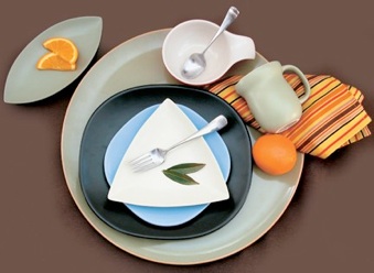
We worked on a project that was called “Yuyu”, and there was (still is) a resurgence of interest in Mid - Century Modern. As a design director, I can’t tell you how many design proposals I reviewed that involved triangular plates - everyone thought they were the first ones to come up with that idea. We thought it was a great idea who’s time might never come. We designed a line of dinnerware using this idea, and it’s one of our favorites. It involved different shapes - a circle, a super ellipse, a triangle and leaf shape. We did this in a matte glaze, in the spirit of the era. We love it! We made every shape do something interesting - the cup fits into your hand, the leaf-shaped plate and the porringer- handle bowl are unusual.
It’s really a great idea who’s time has come.
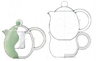
Teapots are a category unto themselves, often the defining shape of a dinnerware group, and they can stand alone.


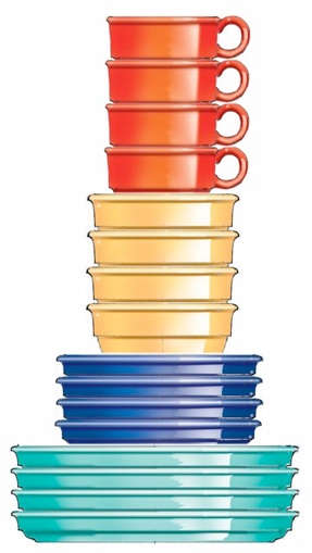
Above is a picture of the basic shapes, and to the right is how they stack up. Gorham turned this over to Lenox,who turned it over to Dansk, who made all the bright colors into stripes, and called it “Stacking Stripes”.
Later it reemerged as “Pajaro Stripes”.
This is an example of how a particular dinnerware shape gets used over and over once molds are made.
Many times we would design a “shape” to fulfill some particular need, and it would be decorated by others. One such project, for Gorham, was to design rugged casual dinnerware that stacked like the dishes they use in Diners. It was either to have stripes or be solid color. We made drawings of several different versions involving cups, mugs, bowls, and different sized plates. We had originally thought of it as either having blue bands or being solid colors.

The great industrial designer and architect Ettore Sottsass asked “has design improved over time?” Probably not. We have done a lot of work with historic architecture, which is on this site as another subject. Whether it’s a building or a dinner plate, everything has a “point in time” and we have often been ahead of the curve with product designs. We can design great things, but we are only as good as our clients and what the marketplace allows.
The tabletop business is unusual, and not being a marketing person, I can only relate to it from the standpoint of a designer - I don’t think form follows function here, although we have always designed forms that function properly as the basis of whatever surface decoration might be applied.

This required a dedicated team effort with some large organizations - Sango, Corning Glass, all the marketing talent of Corning Designs, the insight of Sara Little, and close work with the factory. I don’t think any company in recent history has ever invested as many resources in a “shape”. In its white, undecorated form, it’s difficult to improve on the proportions, so It represents as good as you can get for white-on-white. Of course, it was not usually sold in the undecorated form.


